


This guide is part of the Microsoft Excel 2010 series
1.
Add a print button to the tool bar in excel 2010
2. Create a bar graph in Excel 2010
3. How to add a background image to excel 2010
4. How to add a column to a spreadsheet in excel 2010
5. How to add a URL to Excel 2010
6. How to adjust the print layout in Excel 2010
7. How to auto fit column width in excel 2010
8. How to convert a column into a row in Excel 2010
9. How to convert excel 2010 to PDF
10. How to create a dashboard in Excel 2010
Make: Microsoft
Model / Product: Excel
Version: 2010
Objective / Info: Learn how to create a bar graph in Excel 2010. In this example the chart will have 2 sets of data. One vertical - the revenue and one horizontal - the year.
Model / Product: Excel
Version: 2010
Objective / Info: Learn how to create a bar graph in Excel 2010. In this example the chart will have 2 sets of data. One vertical - the revenue and one horizontal - the year.
1
Open Excel from the start menu or by clicking the desktop icon.
2
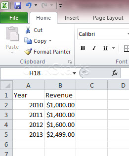
Add the information that you would like to include in the bar graph to your spreadsheet. Note :
Do not select all of the cells.
3
Click the "Insert" tab at the top of Excel.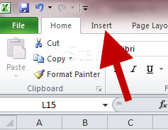
4
Click the "Column" button on the menu.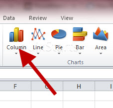
5
Select the type of layout that you want for your chart.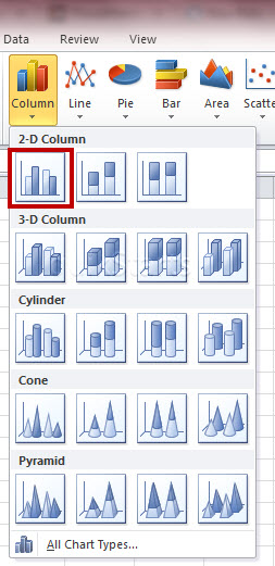
6
A blank box should appear in the center of your worksheet.
7
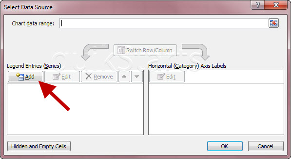
Click the "Select Data" button on the menu.
8
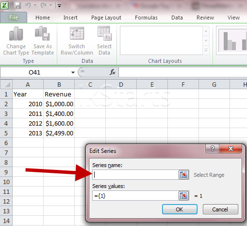
A new pop up window should open. Click the "Add" button.
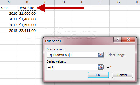
9
A new pop up window should open. Click inside of the "Series Name" field.

10
Click the cell that contains the name of the data that you would like to appear vertically on the left of the chart.
11
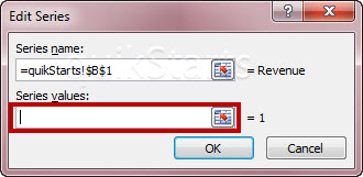
Click inside of the "Series Values" field.
Note :
Be sure that you remove any existing data from this field.
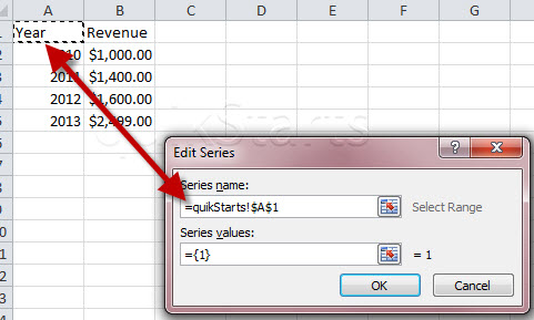
12
Click and drag the mouse across the cells in the column that contains the data that you want to appear vertically. Release the mouse button when you are done.
Note :
This should be the same column that matches your selection in step 10. The pop up box may become compact.
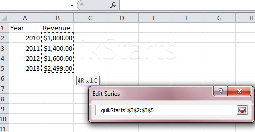
13
The popup box may look like the one pictured here. Press the "Enter" key on the keyboard.
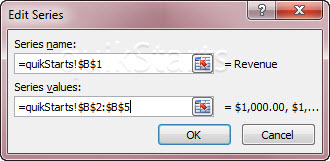
14
The pop up box that you used in step 8 should reappear containing the data you just entered. Your chart should now show the data that you selected to this point.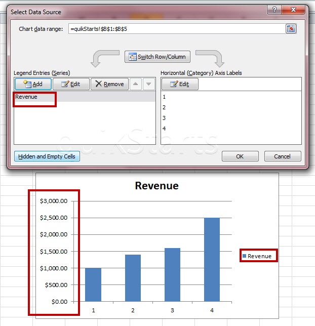
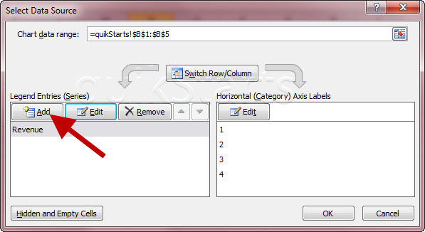
15
Click the "Add" button.
16
A new pop up window should open. Click inside of the "Series Name" field.
17
Click the cell that contains the name of the data that you would like to appear horizontally across the bottom of the chart.
Note :
Optionally you just can type in the name if you like.
18
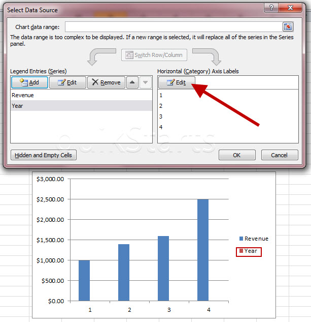
Click the "Edit" button on the right side of the box. Note :
You should now see the word that you just selected in your chart now. In this example it is "Year."
19
Click and drag the mouse across the cells in the column that contains the data that you want to appear horizontally. Release when you are done. Click the "Ok" button or press the "Enter" key on your keyboard.

20
The pop up box that you used in step 18 should reappear containing the data you just entered. Your chart should now show the data that you selected to this point. Click the "Ok" button in the pop up window.21
This task should be complete. Review the steps if you had any issues and try again. Submit questions or request for more guides in the questions section below.comments powered by Disqus
 Ask a question or provide an answer